About GIVA
GIVA is an online jewelry brand known for its modern, elegant designs, often targeting young and style-conscious customers who appreciate high-quality yet affordable pieces. The brand offers a range of jewelry items, including rings, earrings, bracelets, necklaces, and customized pieces in materials like silver and gold-plated finishes. GIVA often emphasizes craftsmanship, timeless designs, and affordability, aiming to make luxury jewelry accessible.
Problem Statement
Users often struggle with navigating the GIVA app due to several pain points, including challenges with order tracking, incomplete product information, and the inability to leave reviews. The app’s limited filter options and complicated address management add to the frustration, creating a less-than-ideal shopping experience.

People love GIVA,
but they could love it even more.
#3 Goal
Creating engaging shopping experience to build trust and reduce hesitation in purchase decisions.
Improve the app's usability, making it easier for users to find products
#4 Design Journey
Research
- Knowing about GIVA Value & Aesthetics
- Analyzing GIVA app
- Going through user feedbacks on app
- Competitive Analysis (TANISHQ, Melorra, CaratLane) and gathering insights
- Analyze the most used e-commerce(Amazon)
Ideate
- Gathering all user-reported issues, usability issues, insights and grouping similar ones
- Develop GIVA design pattern
- Create Wireframes for Key Screens
Design
- Build Design Systems
- Design High-Fidelity Screens
- Checked for Accessibility
My Role
As the UI/UX designer, I ensure consistency and effectiveness while creating user-centered designs throughout the application.
Understanding GIVA’s Current User
I began the project with quick primary research, gathering data from several surveys conducted in India and analyzing customer reviews on the Google Play Store. The primary purpose of this research was to understand users' specific pain points and expectations during onboarding, product purchasing, and while buying gold or silver jewelry.
Qualitative Research
Customer feedbacks
Analyzed customer reviews on the Google Play Store to identify pain points and expectations during onboarding and the purchase of gold or silver jewelry.
Issues identified commonly
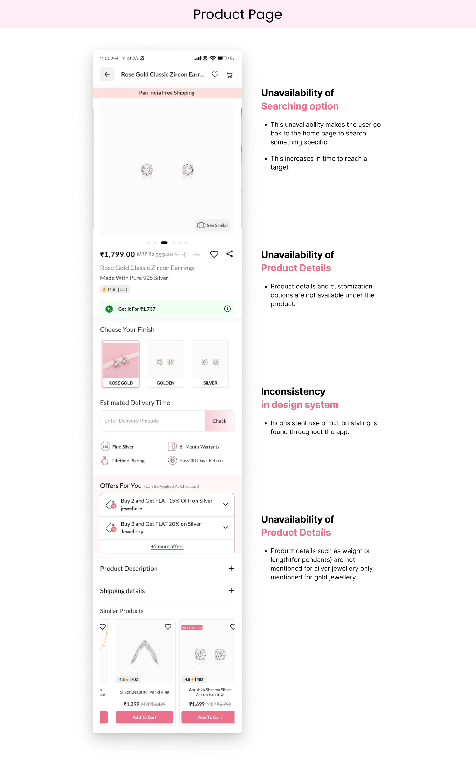
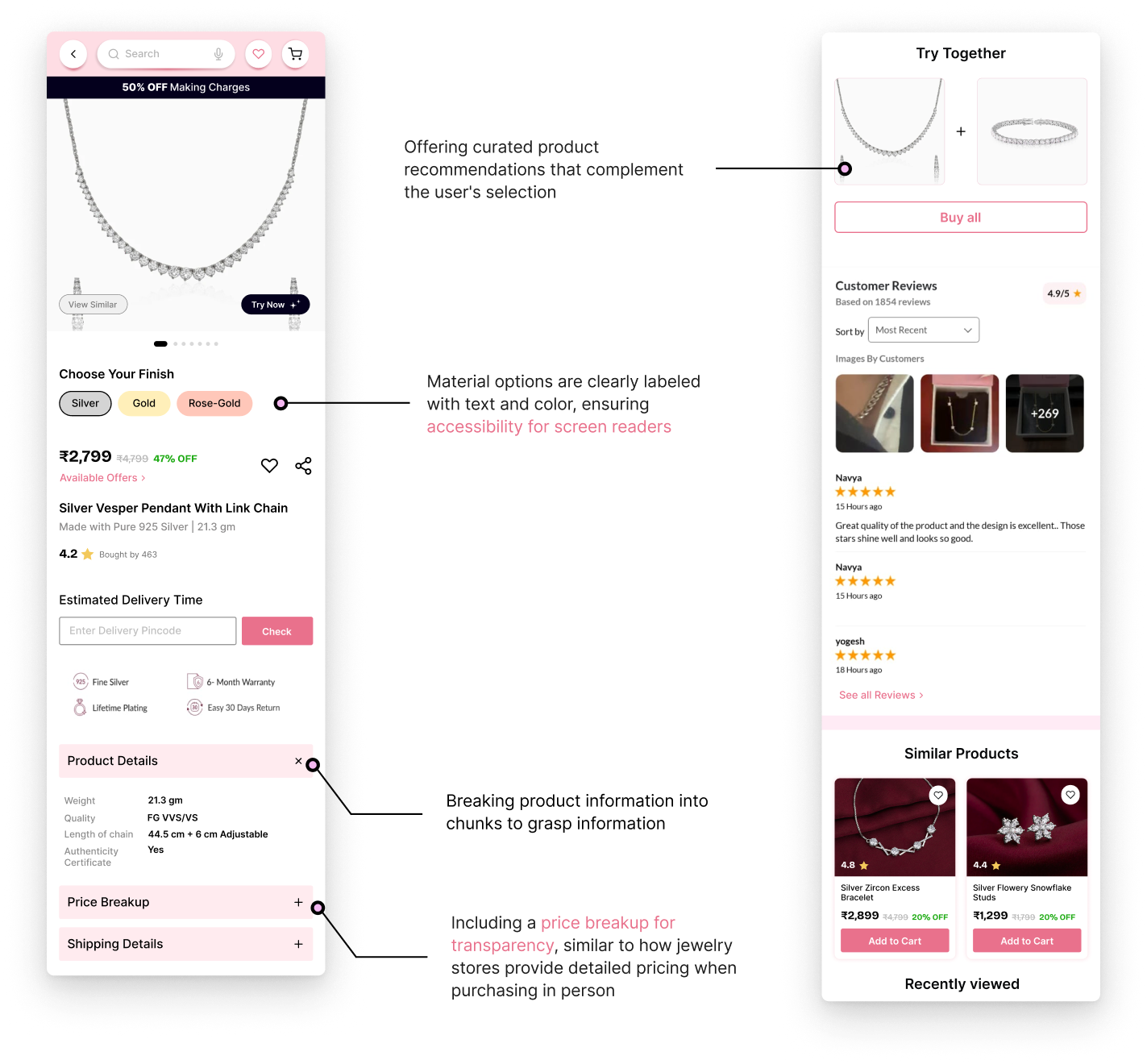
- Lack of key product details, such as weight and making charges.
- Difficult address addition process.
- Cluttered and confusing designs
- Inconsistency when attempting to Login
Jewelry Preferences Survey
PREETA AGARWAL, leading jewelry influencer conducted a Jewellery Preferences Survey in collaboration with GJEPC.
Metal Preferences
18K gold is popular, with rising interest in 14K and gold-silver combinations.
Hallmarking
27% of gold jewelry lacked hallmarking, and 14% didn't have GST receipts.
Design Priorities
Unique designs are favored over specific gemstones.
Lab-Grown Diamonds
Awareness is high, though only 10% of consumers purchase them, with growing interest.
Wear Trends
Lightweight, versatile jewelry is trending, especially stacking rings and earrings.
Market Research
E-commerce Design Pattern
After completing the competitive research, I focused on analyzing Amazon, one of the most widely used shopping apps. My goal was to explore its design patterns and gather insights to enhance my understanding of user behavior, particularly around product discovery, navigation, reviews, and the overall shopping experience.
Based on Amazon’s design pattern, the homepage focuses on showcasing product varieties and deals through broad categories and promotions rather than detailed product cards with prices. The emphasis is on highlighting discounts, top deals, and popular items, with minimal focus on specific product details.
This approach encourages exploration and browsing rather than driving immediate product selection, allowing users to navigate through various categories and seasonal offers with ease.
Analysis of GIVA App
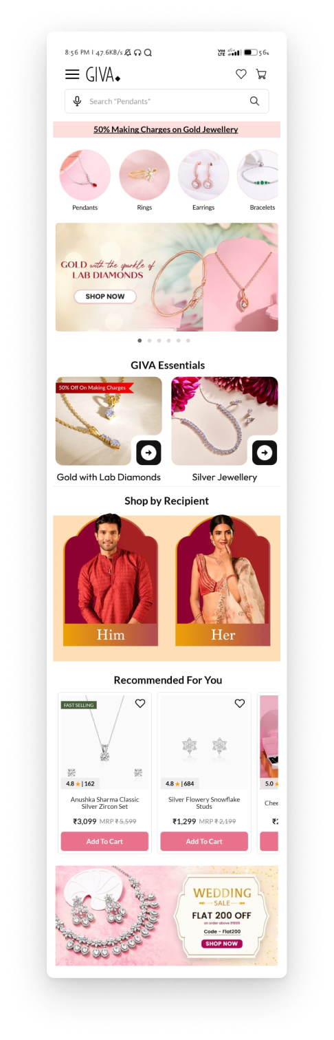
To pin point usability issues and areas of improvement in the current user experience, I closely analysed the current app, considering the insights I got from surveys,review and applying UX principles.
Missing Out on Key
Offers and Promotions
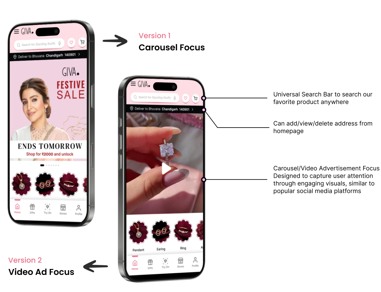
- Current banner size is too small, making offers easy to miss.
- This does not adapt to the modern attention span shaped by social media usage.
Easily Manage
Delivery Address
- Adding this feature allows users to manage their delivery preferences
Standardizing
Product card
- Product cards can show the value of the deal
- It might be beneficial to display the jewellery against a contrasting color background to enhance its visibility and allow the details and craftsmanship to stand out more clearly
Discover
Gold with Lab Diamonds
- Without a focused approach on lab-grown diamonds, customers may overlook these sustainable, high-quality alternatives.
Showcasing what
fits user taste
- Recommend jewellery that matches user preferences/history
- Including personalized sections helps users easily continue their shopping journey and find relevant products quickly.
Design Pattern
The design pattern for GIVA should focus on delivering a personalized, visually appealing, and easy-to-navigate experience for both logged-in and non-logged-in users. For new users, the app should present a clean and engaging default view, highlighting trending collections, bestsellers, and seasonal promotions with high-quality visuals. For logged-in users, the experience should shift toward personalization, with features like tailored product recommendations, a visible wishlist, and quick access to previously viewed items.
Improved User Engagement and Conversion Rate
A personalized design will encourage users to explore more products and increase interaction, driving higher conversion rates.
Stronger Brand Loyalty and Customer Retention
A seamless, brand-aligned experience builds trust, promoting repeat visits and stronger customer retention.


Style Guide
Color Palette
Typography
Header 1 - 32
Header 2 - 28
Header 3 - 24
Sub-Header - 20
Body - 16
Sub-text - 12
Text - 20
Sub-Text - 16
Iconography
Feather Icons

From Concept to Reality
Home Page
Product Page
Product Page User Flow
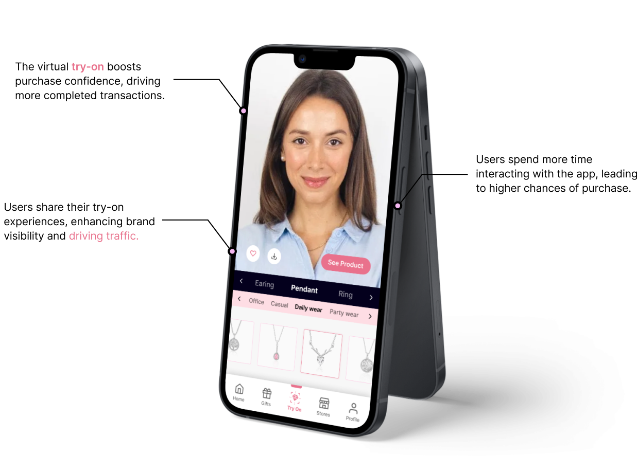
Try-On Feature