
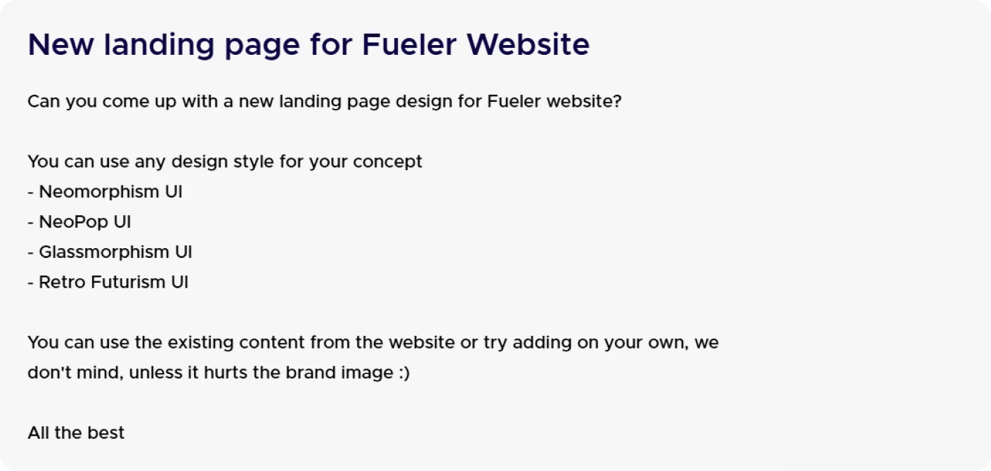
UI Challenge
Desk research
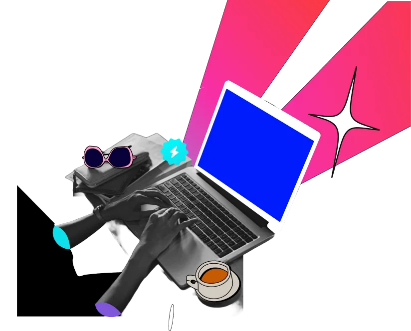
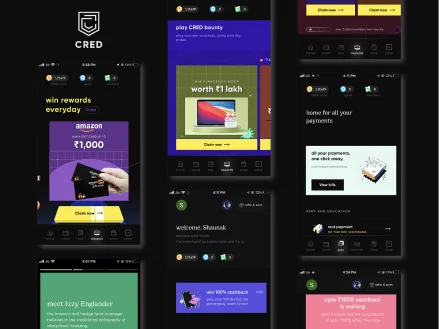
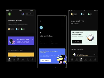
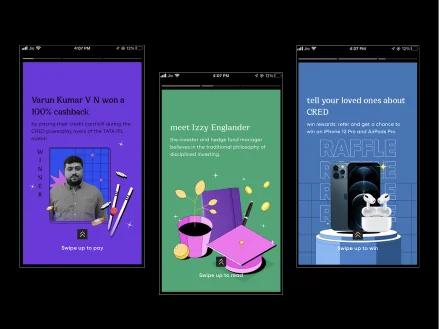
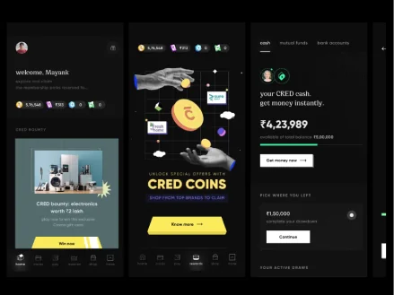
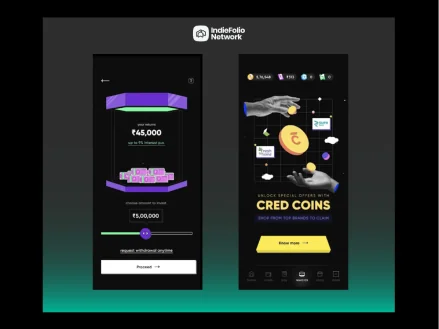
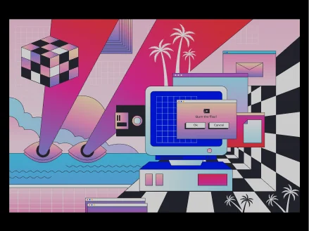
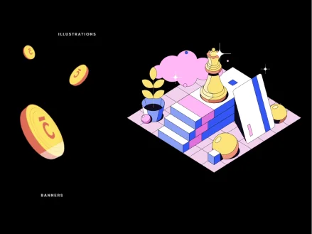
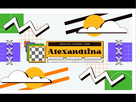
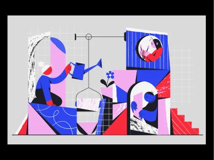
Understanding NeoPOP aesthetics, with research into vibrant color palettes, bold shapes, pop culture references, and playful compositions.
Color
Fueler’s color palette brings together bold contrasts and vibrant accents to reflect creativity, energy, and individuality—giving people’s work a space to stand out. Together, these colors create a playful, expressive NeoPOP identity that connects with creators and reinforces Fueler’s focus on showcasing talent through proof of work.
Brand palette
#0EDFEA#0D0543Accent palette
#7F56D9#EEA5FF#001AFC#EF116FNeutral palette
#000000#B7B7B7#FFFFFFTypography
Fueler’s typography balances vibrant energy and professionalism with a modern type pairing, reinforcing the commitment to a trustworthy platform.
Poppins
Bricolage
Grotesque
Headline/Extrabold - 68
Sub - Headline/Bold - 40
Body/Medium - 20
Body/Regular - 18
Body/Regular - 16
Design

Vibe coded website
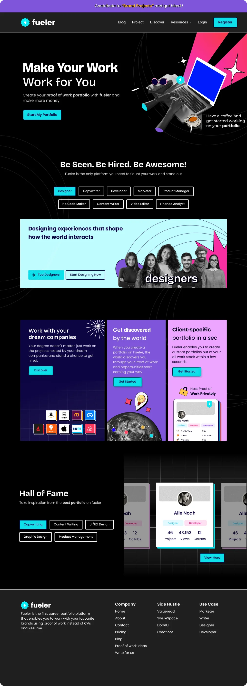
The visual system comes together in a responsive landing page concept, carrying the NeoPOP direction from desktop through mobile.
Open design preview ↗